Graduate Student Ryan Morill’s project is an analysis of rental prices on the lodging platform Airbnb in the Boston area—tracking bookings over a set period of time.

Ryan:
There are several variables to look at in this particular dataset, but I chose to focus on three: price, location, and room-type. Depending on how these variables are organized and visualized in relation to one another there are different, interesting patterns to unlock.
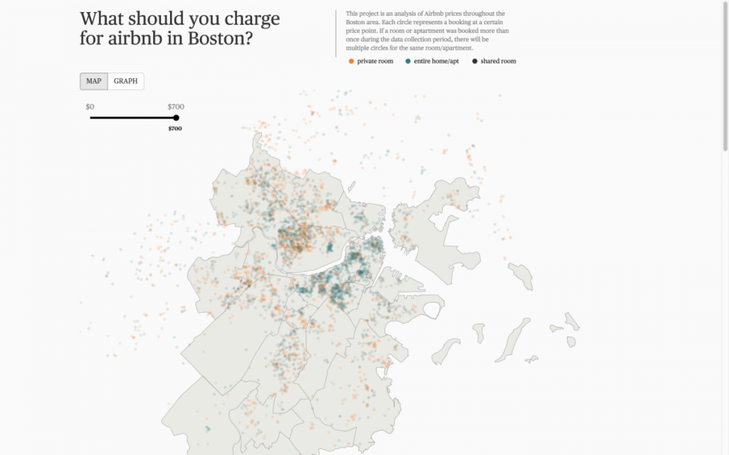
The first visualization is a map of Boston and a few surrounding communities. Each booking is represented on the map with a semi-transparent circle/dot, so as they overlap, the color becomes more intense and it’s easy to identify higher concentrations of bookings. For example, popular areas like the North End, Back Bay, and Beacon Hill are clearly denoted by their higher concentrations of color. These historic neighborhoods are popular among tourists, but perhaps this clustering is also a result of renters/home-owners needing to supplement their rent/mortgage in these notoriously high rent districts. Or, perhaps there is even some exploitation of the system targeting these areas.

The next step is distinguishing between the different types of bookings using color. Most bookings are either “private rooms” (orange) or “entire homes/apartments” (blue). In the “Boston proper” area, it’s clear that most of the bookings are “entire homes/ apartments” (blue). As you move outside of this area, more “private rooms” (orange dots) appear. Cambridgeport, for example, has a clustering of orange dots. This area is more residential than other popular areas, with more single family or multi-bedroom homes, and it would make sense that extra rooms for Airbnb might be available.
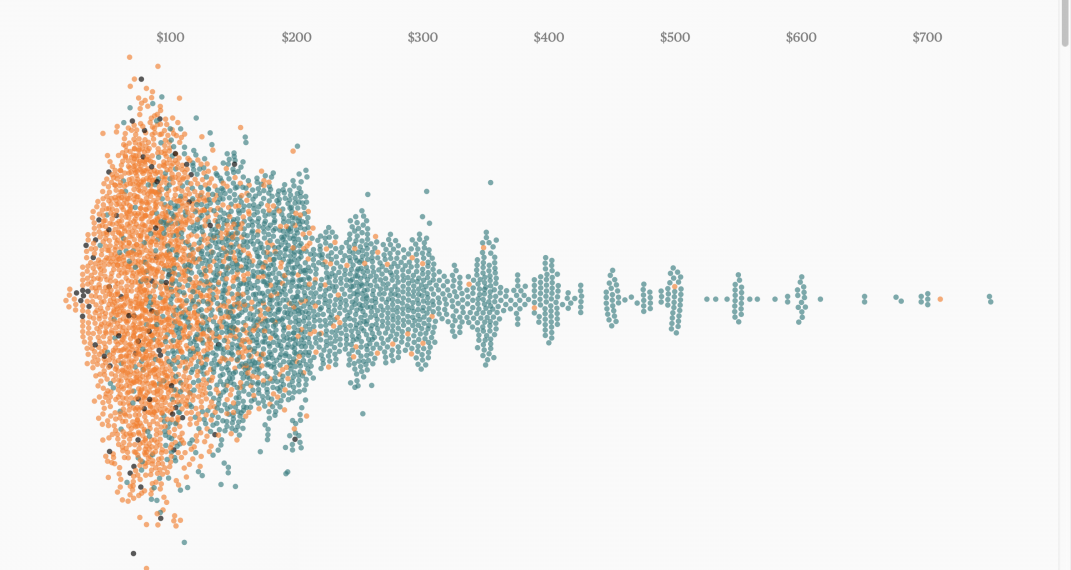
The final variable is price, which is captured both in the tooltip and the slider. This provides some context and allows for some manipulation in the map view, but the real analysis of price comes when we click “graph.” This reorganizes the dots based on pricing criteria instead of geographic criteria. The visualization method has not changed, only the positioning of the dots. The first view (“total”) is essentially a stream graph histogram showing the price distribution. As we might expect, the “private rooms” are cheaper than the “entire home/apartment” bookings. Also, there is a huge cluster of bookings right around the $100 range. As we move out to more expensive bookings, a pattern emerges where prices cluster around $25 increments. This may be the result of individuals determining their own prices, as opposed to hotels which rely on pricing algorithms.
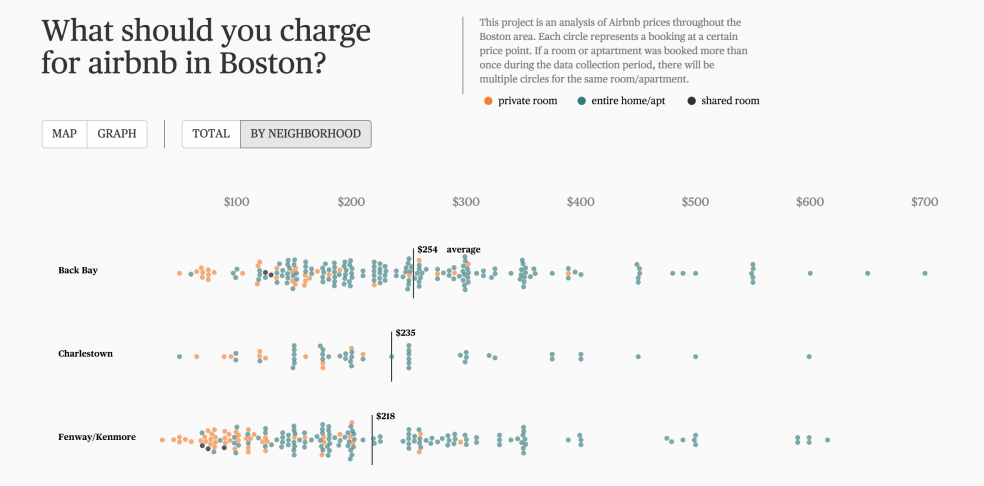
To capture location in this view, we can reorganize the dots again and break them out vertically by their respective neighborhood, sorted by price. This view allows us to see a lot of information at once: the general distribution and deviation of prices, the size of the market in each neighborhood, the breakout of room-types and the role room-type plays on price. It’s clear as you scroll down that the cheaper private rooms reduce the average in certain areas. I imagine this type of visualization would be helpful for someone trying to figure out what they should charge for their particular booking in any given area.
By

Ryan Morill
Designer
THE TEAM
Ryan Morill, Designer
Siqi Zhu, Advisor

