Diversity Traces
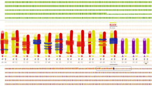 An interactive lens on multi-racial families in the United States 1860-2020
Pedro Cruz
When looking at diversity from a racial perspective, homogenous communities are still the norm, as they remain siloed not only locally, but in their very own households as well. This visualization project comes as a celebration of the fringe couples and families who have a multi-racial identity, effectively embodying the intermingling of races, and dissolving the systemic barriers put on their very own existence. According to the census, there are only vestiges of these multi-racial families from 1860 to 1980. More recently, there has been a surge of these families in the data, but they are still a rarity, still mere traces of diversity in America.
Design Observatory
 Paolo Ciuccarelli and Steven Geofry
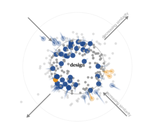
To disambiguate the meaning of design practice in different domains, the Center for Design is launching the “Design Observatory,” a research project that will use various methods and materials to map out the landscape of design in different spaces of practice. The Observatory aims to examine how design is talked about, referred to, and practiced in different domains, in the process investigating how it has evolved and where it is going in the future such as to situate encounters with design in a larger historical, practical, and theoretical context. The most recent output of the Observatory is a multimodal visualization titled “Design Vocabularies.”
Design Vocabularies Data Sonification Installation
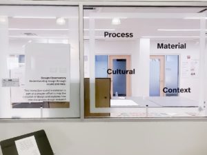 We explored the archive of the Design Studies Journal from 1979 to today, in search of emerging concepts. By interacting with the Center for Design’s windows, the public will hear these concepts as they progressively emerge from the discourse around design of the past 30 years, in the form of concrete sentences…
Team members: Sara Lenzi and Victor Zappi
CAMD students: Charlie Daigle and Jason Hoopes
New Elements
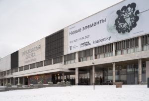
New Tretyakov Gallery, Moscow, Russia
Co-curated by Dietmar Offenhuber and Daria Parkhomenko
The exhibition NEW ELEMENTS explores an unusual perspective on data and computation, centering on the physicality of information and its implications for how we make sense of the world. 12 works by artists from different countries show how to close the gap between data and the world.
“The idea that digital information is abstract and exists outside the physical world is a harmful myth. Since technology has entered all aspects of our lives, its material nature deeply affects us. Artworks at New Elements bring digital data back to reality and show how everything is interconnected” — Dietmar Offenhuber
Organized by Laboratoria Arts & Science Foundation, made in strategic partnership with Kaspersky.
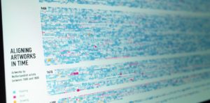
Visualizing the 17th Century Netherlandish Art Market
 Museum of Fine Arts, Boston
Kristian Kloeckl and Pedro Cruz
As part of a collaboration between the Museum of Fine Arts in Boston, Experience Design Lab and the Co-Lab for Data Impact Kristian Kloeckl and Pedro Cruz developed two data visualizations to complement the visitor experience at the museum’s new Center for Netherlandish Art galleries that were inaugurated on November 20, 2021. The project team also includes the two students Shan Wei and Niyati Kothari from our Experience Design and our Information Design and Visualization graduate program.
The two visualizations are based on datasets hosted by the Netherlands Institute for Art History (RKD) in The Hague on Dutch and Flemish artists and artworks. These datasets have been compiled over several decades, continue to be updated, and currently contain information on 374,330 artists and 258,832 works of art from the 15th century to the present day. The dataset is based on ongoing historic research for which not all parts are equally complete. The raw datasets are ontological – networks of concepts interconnected by relations – and had to be converted to a linear time-based data-narrative.
Organizational Knowledge Map
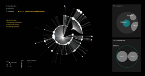 This project was collaborated by Banca Intesa S.p.A., an Italian banking group, and the design team led by Paolo Ciuccarelli from the Center for Design, Northeastern University. The project aimed to create a collection of data visualizations for Banca Intesa S.p.A. to explore its impacts on the growth of knowledge depth in the company. The results will be used for developing the training program and supporting the future business plan.
Team members: Matt Blanco, Design Research Assistant, Northeastern University; Paolo Ciuccarelli, Director, Center for Design; Estefania Ciliotta Chehade, Postdoc Strategist and Researcher, Center for Design; Daniella Fernandes, Design Research Assistant, Northeastern University; Joli Holmes, Design Research Assistant, Northeastern University; Yuan Hua, Design Research Assistant, Northeastern University; Todd Linkner, Assistant Teaching Professor, Northeastern University; Houjiang Liu, Ph.D. Student, University of Texas at Austin; Wenting Yue, Design Research Assistant, Northeastern University
Partners: Banca Intesa, Italy
Shenzhen Biennale
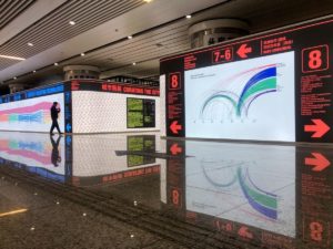
A visual atlas of the curatorial process behind – and before – the Eyes of the City. The body of the curatorial process has been dissected into eleven charts that expose the richness of the corpus of metadata and descriptions attached to each and every one of the submitted applications.
The aim is to unfold the complexity of the curatorial process, to make it legible, and to re-constitute the ensemble of all the applications as a (big) picture of the current status of design and research in architecture and urban planning. Who applied, from where, when, and what do all these proposals have in common in terms of topics and imagery? Navigating the flows and the nets of data you can find the answers and step into the tree of decisions that builds an exhibition, before entering it.
Project Team: Paolo Ciuccarelli, Lead Designer; Yinan Dong, data visualization; Yuan Hua, data visualization; Todd Linkner, data visualization; Yuqing Liu, data visualization ; Nicole Zizzi, data visualization
Want to Stay Up to Date on the CfD?

